

Flexbox is a layout mode in CSS that allows you to easily align and distribute items within a container. Let's see different CSS properties and their use.
display: flex;
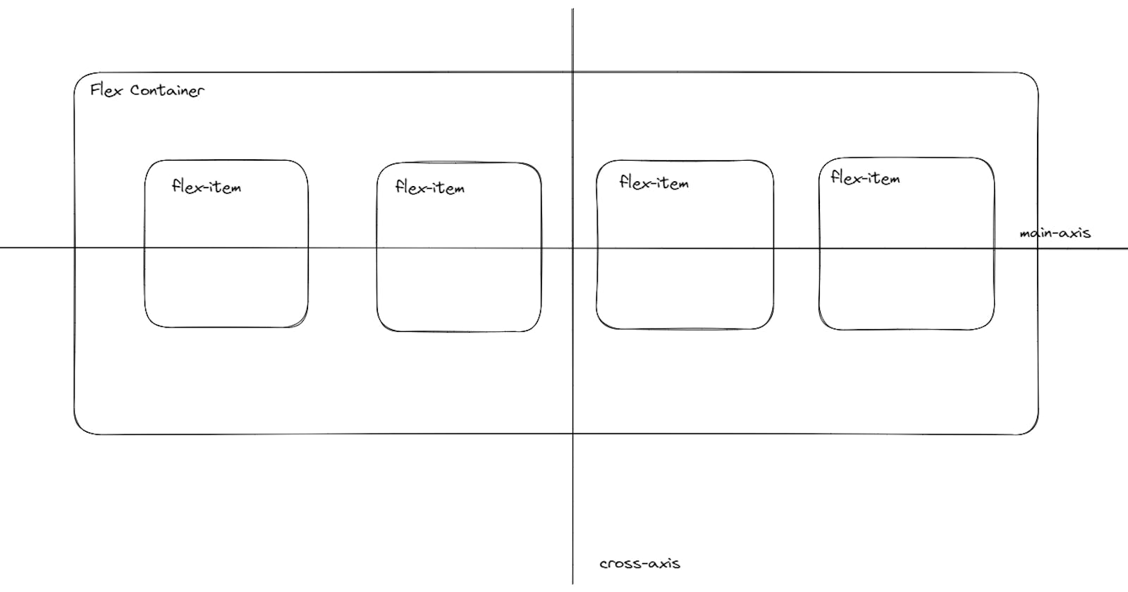
As you can see in the main image of the article there are two components i.e. flex-container and flex-item. When the display property of the parent container is made flex
display: flex;then children i.e. flex-items shrink to the size of the content inside them and form columns next to each other.When we make parents display flex, there are two axes along it. The main-axis and cross-axis. By default, the main-axis will be horizontal (left to right) and the cross-axis vertical (top to bottom). We can change the axis and direction using the
flex-directionproperty.
flex-direction
flex-direction: rowis the default. The parent is a row and the children(flex-items) are columns.-
flex-direction: column;The parent is a column and the children(flex-items) are rows.-
similarly, try
flex-direction: row-reverse;&flex-direction: column-reverse;-
flex-wrap
flex-wrap: nowrap;is the default value. This results in the shrinking of flex-items up to a width of min-content and then the overflow of flex-items outside the parent container.In the 1st example of flex-direction: row; the width of flex-items is set to 300px, but the container width is not sufficient to accommodate 4 boxes of 300px width. So flex-items are reduced in size to fit inside the container. To avoid shrinking flex items
flex-wrap: wrap;is used.-
flex-wrap: wrap-reverse;changes the direction of the cross-axis.
flex-flow
shorthand to set
flex-directionandflex-wrapproperties.Syntax:
flex-flow: <flex-direction> <flex-wrap>;flex-flow: column wrap; flex-flow: column wrap-reverse;
justify-content
This property decided the distribution of additional space available on the main-axis between the children.
justify-content: space-between;takes additional space along the main-axis and puts it between the children.justify-content: space-around;takes additional space along the main-axis and puts it around the children.justify-content: flex-start;pushes elements to the start of main-axisjustify-content: flex-end;pushes elements to the end of main-axisjustify-content: center;centers all the flex-items along the main axis-
align-items
similar to
justify-content,align-itemsworks on the cross-axis.align-items: stretch;is the default value that makes elements have the same size along the cross-axis.align-items: flex-start;all items will be aligned at the start of the cross-axis with the default size.align-items: flex-end;all items will be aligned at the end of the cross-axis with the default size.align-items: center;all items will be aligned at the center of the cross-axis with the default size.align-items: baseline;the first line of content inside children will be aligned on the same baseline
There are much more things we can do with flex by using flex-grow, flex-shrink, flex-basis, and order properties.